
Raising the Standard — A UX Audit for a More Accessible DTC Experience
SharkNinja is a global product design and technology powerhouse, managing a portfolio of trusted, billion-dollar consumer brands. As the company scaled from an agile pioneer into a global enterprise, maintaining a cohesive and compliant digital ecosystem across its brand web properties became a business-critical priority.
In the wake of compliance violations and legal risks, I was brought on to conduct a comprehensive UX and accessibility ($a11y$) audit of the flagship NinjaKitchen web platform. The objective was to identify critical usability friction points, mitigate legal liability, and deliver a comprehensive remediation strategy to bring the site’s components and core templates up to W3C WCAG AA and AAA compliance standards.

Goals
I was brought in to optimize the end-to-end experience of the Thirsti product pages — improving conversions, creating consistency across NinjaKitchen.com, and leveraging existing research and analytics to drive design decisions. The scope spanned four interconnected problem areas:
Site architecture
Content strategy
Design system components
Usability and accessibility
Approach + Methods
I conducted a component-focused UX and accessibility audit of the Thirsti experience. Working closely with the strategy team, I pulled existing data and analytics to ground the audit in quantitative research — and my qualitative findings consistently reinforced what the data was already surfacing. Zeroing in on repeatable components — product cards, banners, navigation, CTAs, filters, and PDPs — I revealed where issues compounded across the site at scale.
Findings were captured in Airtable, documenting each success criterion, a human-readable definition, site examples, and the team best positioned to resolve it — development, content strategy, or navigation. This structure gave leadership clear scope and a path to prioritization.
Recommendations
Nine component-level issues were identified against WCAG 2.1 AA and AAA standards, organized across four principles — Navigable, Adaptable, Distinguishable, and Operable:
Resize tap targets on mobile
Use inclusive, accessible copy on all CTAs — replace see, view with explore, find, learn more
Optimize tab order and repair heading hierarchy
Implement alt image tags for all images
Remove embedded images in banners
Implement hover states on interactive elements
Allow users to pause videos, animations, mute audio
Ensure keyboard operability
Provide multiple ways to locate content and
navigate the site
Design Solutions:
Thristi Product Pages + Tray Filter Component
The audit findings were compelling enough to prompt a follow-on engagement: optimizing the Thirsti product pages on NinjaKitchen.com. Thirsti presented a unique challenge — SharkNinja's only system-first product, combining the drink system hardware, a CO2 refill subscription, and a shoppable flavor catalog with search and filter functionality. That layered ecosystem required a fundamentally different approach to architecture, content hierarchy, and customer journey than the rest of the product line.
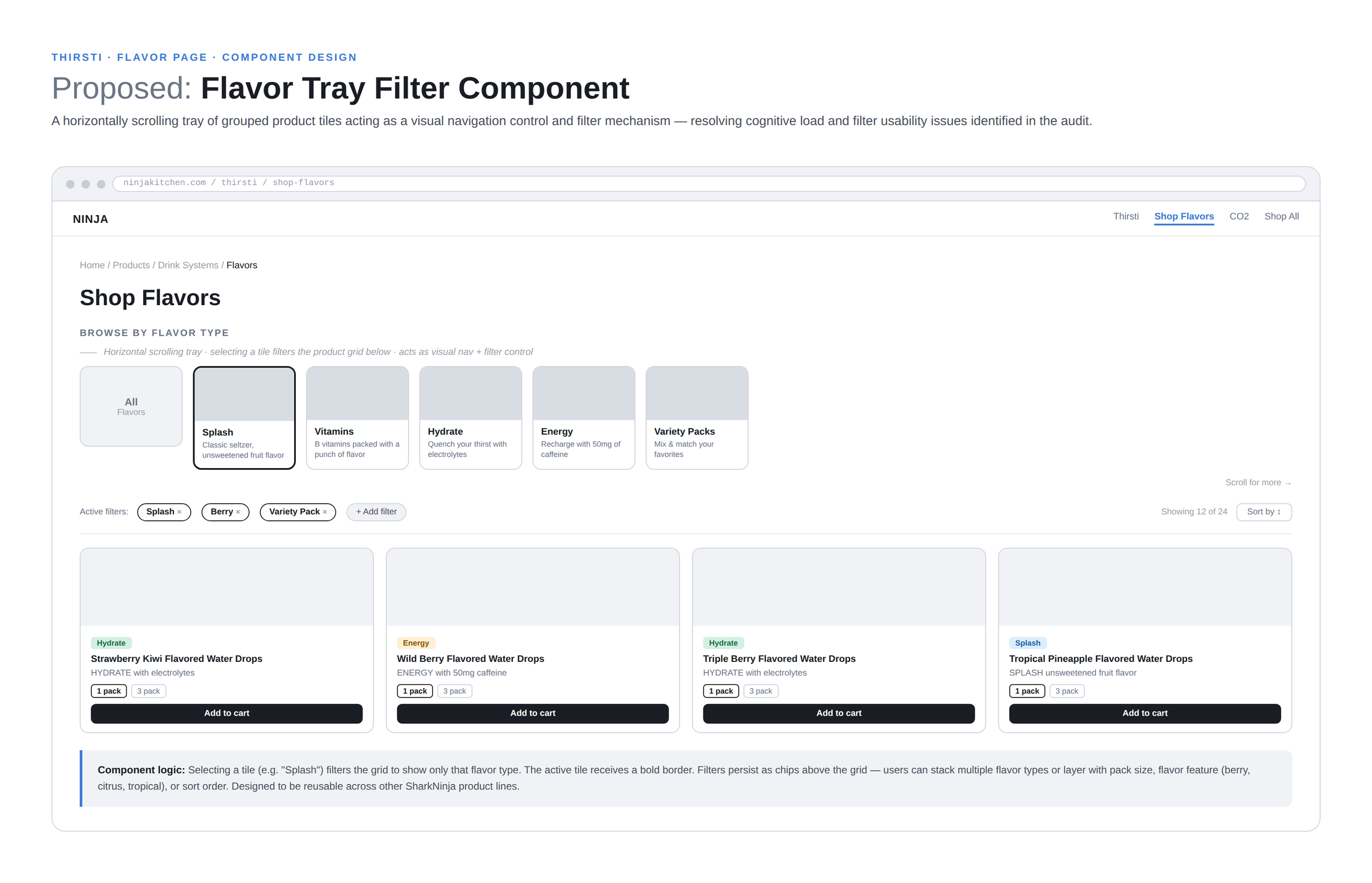
The centerpiece of the solution was a flavor tray component — a horizontally scrolling group of categorized product tiles that acts as both a visual navigation control and a filter mechanism for the product grid below. Selecting a tile filters results by flavor type; active filters persist as chips above the grid, allowing users to stack and refine without losing context. The component directly addressed the cognitive load and filter usability issues identified in the audit, and was designed to be reusable — with the intent to scale the pattern across other SharkNinja product lines.