Reimagining the Apple In-Store Product Discovery Experience
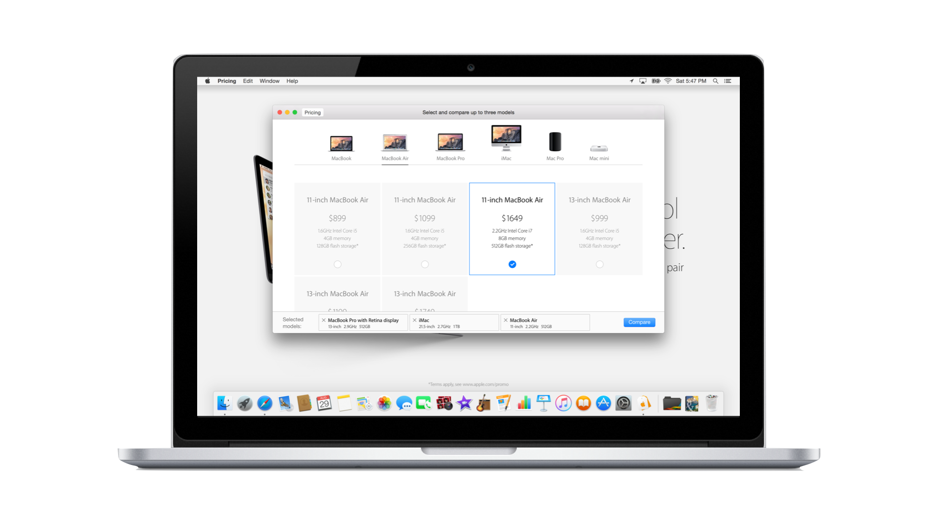
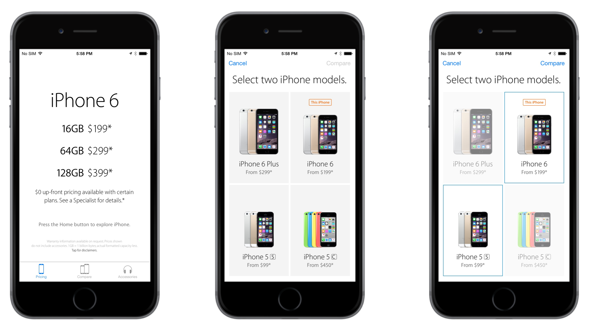
Apple Retail's Smart Signs — dedicated iPads stationed at each product demo table — served as the primary shopping tool for in-store customers, providing product specifications and comparison. The existing solution had two critical limitations. First, specs were siloed by product line, preventing cross-category comparison (ie desktops vs laptops), and the hardware required ongoing maintenance such as charging cycles and updates to proprietary software imaging that pulled retail staff away from customer-facing work.
Apple's Retail Interactive team proposed a native app to replace the Smart Sign system across all demo devices Mac, iPad, and iPhone. The new solution would consolidate product specifications into a single, unified interface and rebuild the compare functionality from the ground up to support dynamic, cross-product decision-making at the point of discovery.
Role: Interactive Designer | Teaam: Retail Interactive, Creative, Development
Approach + Methods
The first step was a comprehensive content audit: gathering all product specifications from in-store Smart Signs, then cross-referencing against third-party resellers and the Apple website across multiple geographies. I owned the master product information document — the single source of truth the entire design system was built on.
My path to this project was a natural fit. I joined the Retail Interactive team as part of Apple's Career Experience program, arriving fresh from completing my MFA program in design and bringing something most designers on the team didn't have: direct, firsthand experience on the Apple retail sales floor. That combination of academic rigor, an understanding of the design process, and real-world retail insight shaped the work at every stage. I contributed from early wireframes and customer pain point analysis through to final production comps and developer specs across mobile and desktop.